Role
Product Designer
Duration
6 Weeks
Tools
Figma
Team
Product & Engineering
Platform
Web mobile & desktop
Concept A:
UI Polish
I tried keeping the single list view but cleaning up the hierarchy.
Verdict: 👎
It looked nicer but was still cognitively heavy. It didn’t solve the ‘delivery’ mental model.
Enhancing Subscription Management for Control, Clarity, and Retention
Context
“It’s not a subscription fee. It’s a recurring grocery run.”
Subscribe & Earn (S&E) is a program where customers schedule products to auto-reorder, earning points for loyalty. It is not a paid membership like Amazon Prime; it’s a commitment to recurring purchases.
While signing up was easy, managing active subscriptions was painful. Users would set up an order, but if they went on vacation or didn’t need milk that week, they hit a wall.
Problem
Customers loved the idea of S&E, but once they subscribed, they felt trapped. The experience was rigid and it was forcing cancellations. To make simple changes, like rescheduling, they had to cancel the subscription entirely just to stop one order.
Business impact: High churn rate (~60 item cancellations/day) and lost recurring revenue (MMR).
Operational impact: increase customer support tickets for manual adjustments.
User impact: Frustration
Objective
Give customers more control over their S&E orders to reduce cancellations and improve retention.
Solution
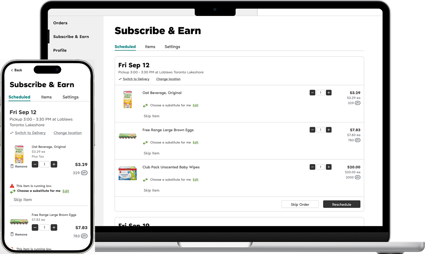
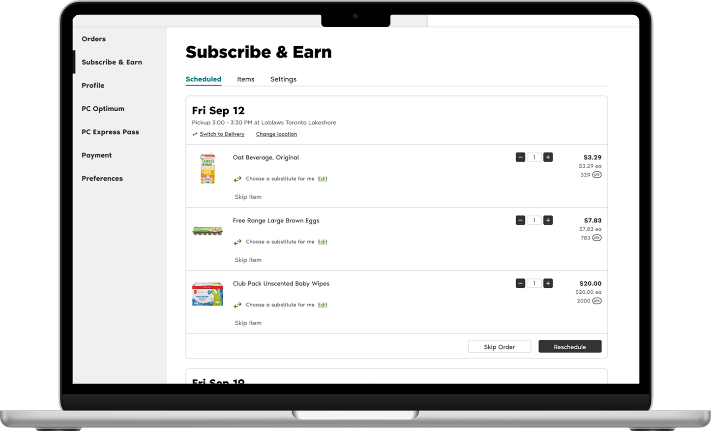
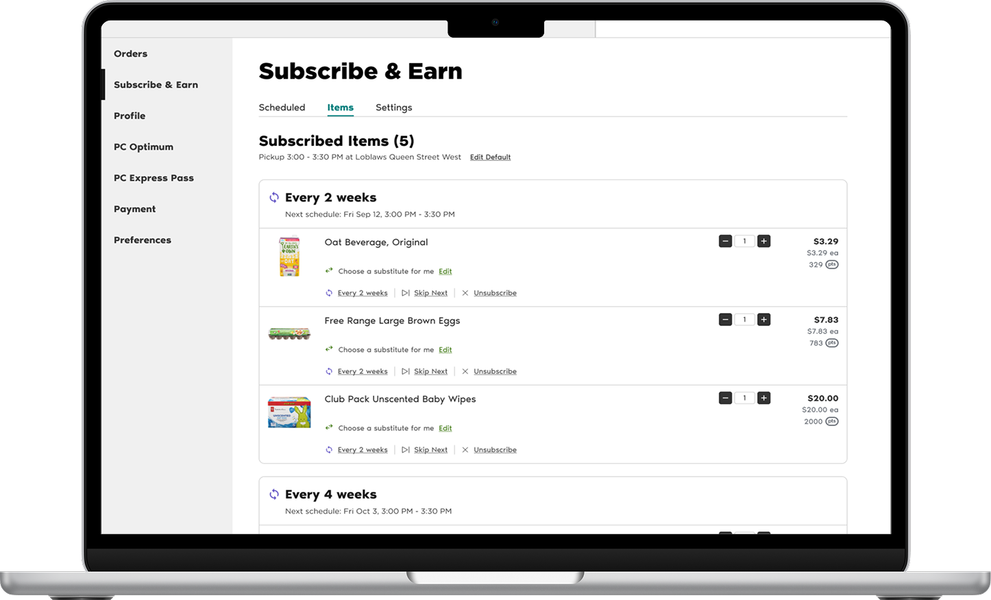
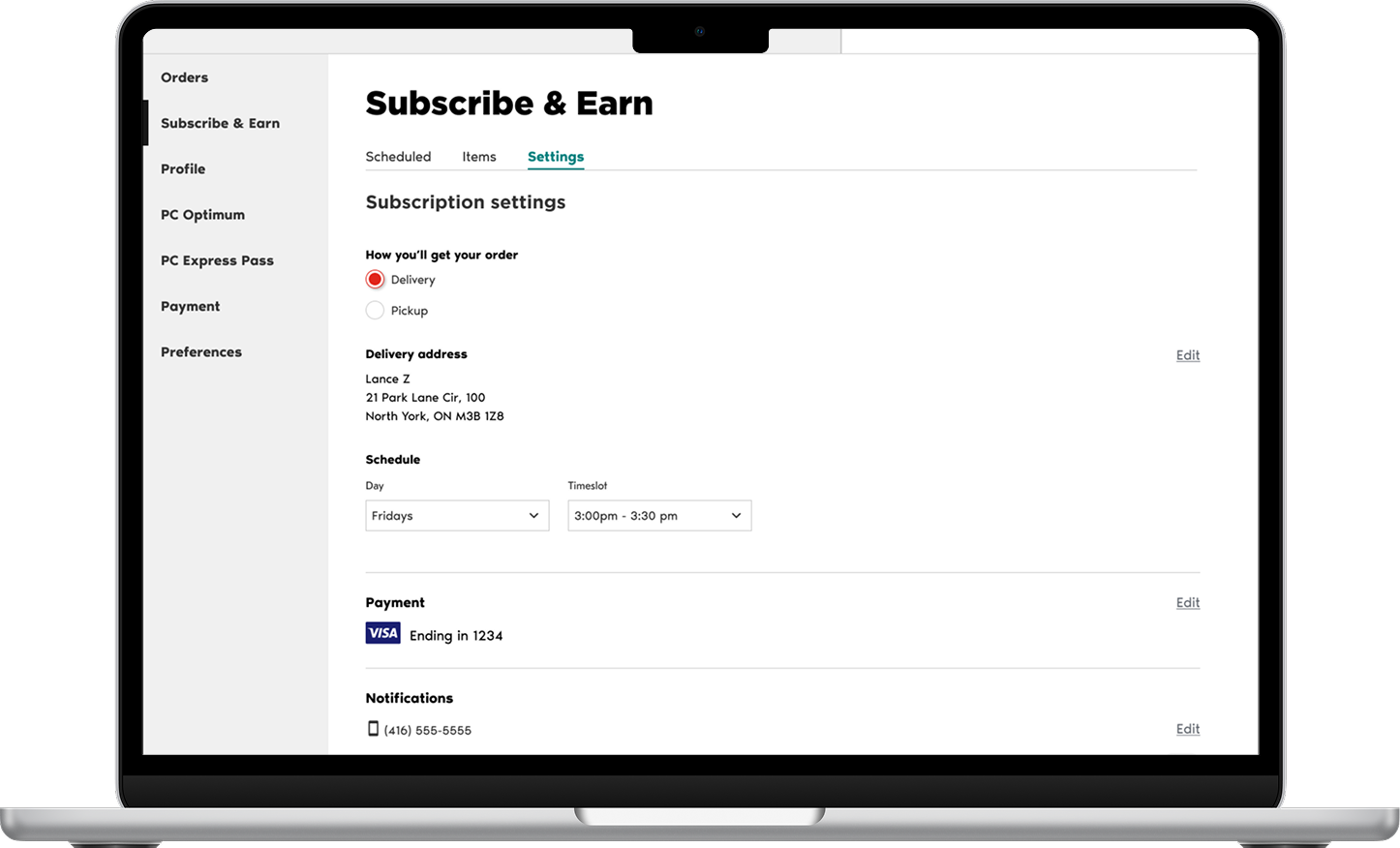
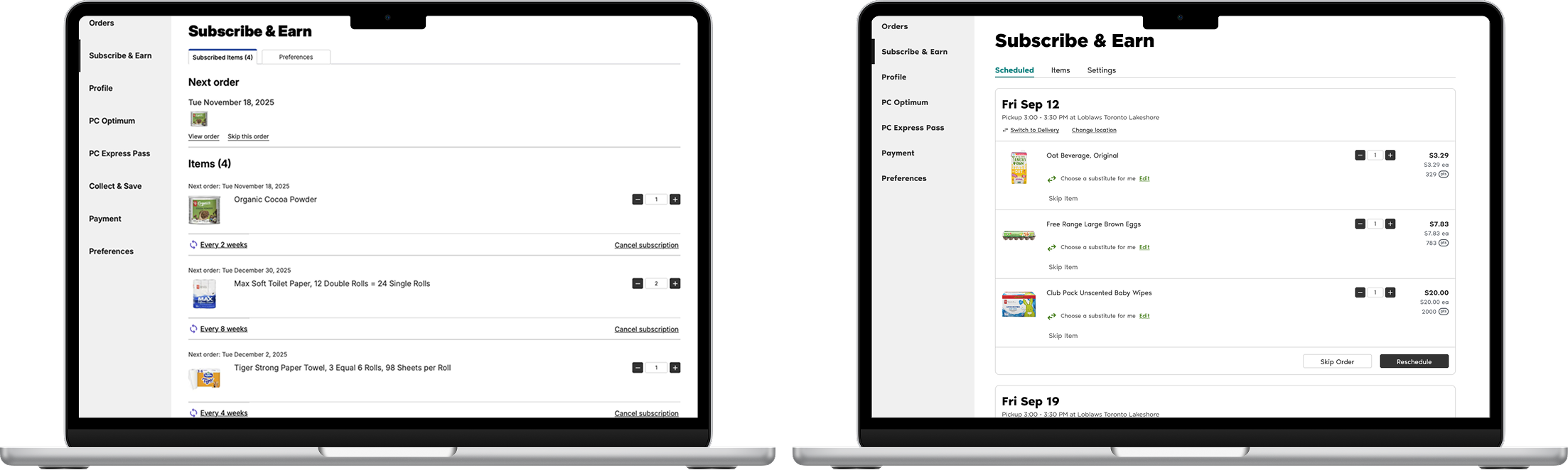
I designed a new management dashboard that shifted the mental model from ‘managing a list of items’ to ‘managing upcoming orders.’ We introduced flexible features such as Reschedule, Change Location, and Switching between Pickup & Delivery.
Impact (Projected)
Reduced Churn and maintain recurring revenue (MMR): By removing the need to unsubscribe just to pause an order
Lower Support Volume: Empowering users to self-serve changes and reduce customer support tickets for manual adjustments.
Overall increased user satisfaction and retention.
Discovery & Insights
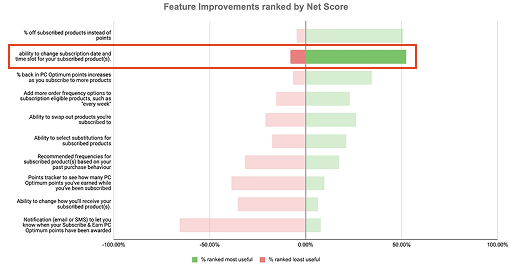
Why are people canceling?
I started by digging into the data and existing research to understand the friction.
Looker Analytics: On average, a customer has 5 subscribed items and 3 items per order. This helped me design realistic mockups that reflected real user patterns.
UXR Reports: Flexibility and control was the #1 requested feature. Users specifically wanted to change dates and times.
Competitive Audit: Across Amazon, Walmart, pet supply stores, and supplement brands, rescheduling is a standard feature. It was the one major capability our program lacked.
Core Insight: Deliveries vs Items
During synthesis, I uncovered a massive mental model mismatch. The existing interface treated every subscription as a standalone item.
But grocery shoppers don’t think in items. They think in deliveries. In real life, you don’t think, ‘My eggs are arriving Tuesday.’ You think, ‘My grocery order is arriving Tuesday.’
Pivot Point -> shift the design from managing a list of products to managing a schedule of deliveries.
Explorations & Iterations
Finding the right structure.
I explored three distinct directions to solve this mental model mismatch. I shared these early concepts with my PM and developer to get quick alignment before moving deeper.
Concept B:
Calendar View
A literal calendar view to show upcoming dates.
Verdict: 👎
Worked on desktop, but not on mobile. It was too crowded and complex to build.
The Winning Direction: Two-Tab Model
We moved forward with Concept C.
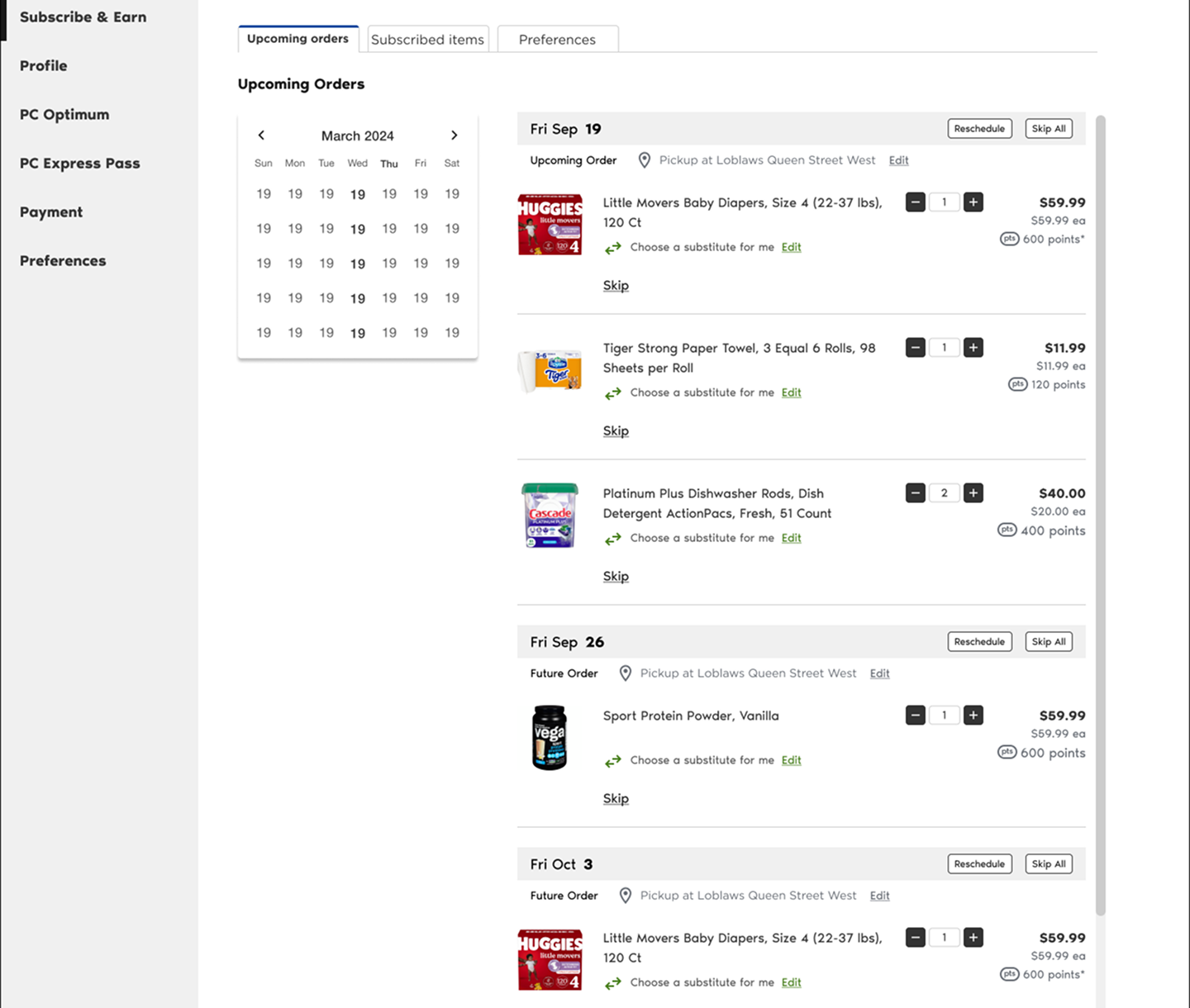
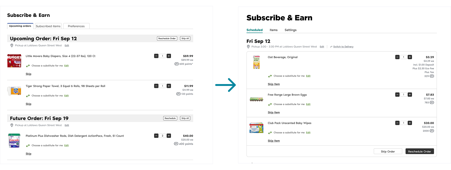
Tab 1: Scheduled Orders. Focused on ‘what’s happening next?’ (Ie. Skip, Reschedule, Change Location).
Tab 2: Subscribed Items. Focused on ‘what are my settings?’ (Ie. Frequency, Quantity, Unsubscribe).
Validation & Refinement
What users say vs. what they do
We ran usability testing with internal and external participants, with 5 each respectively.
The ‘one-page’ hypothesis 2 out of 5 internal participants mentioned they might prefer seeing everything on one page rather than clicking tabs. Instead of ignoring this, I decided to test it.
I mocked up a dense ‘one-page’ version and ran a follow-up test.
Result: Users were overwhelmed. They didn’t know where to start or focus.
Learning: What users say they want (everything visible) isn’t always what helps them to succeed (focus). The Two-Tab model was statistically easier to navigate.
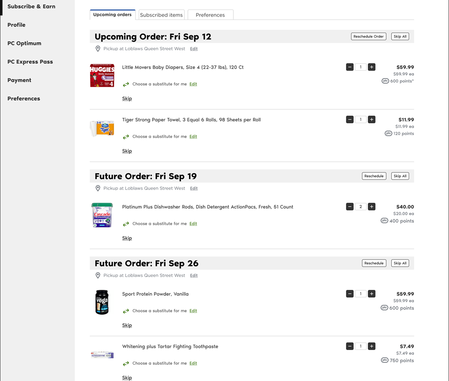
Refining the UI. During team crits and syncs, products and designers pointed out that the list of items felt too open. I iterated to containerize the orders, grouping items visually into cards based on their delivery date. This drastically improved scannability.
Handling Constraints
Designing for reality, not just the happy path.
As we approached handoff, we ran into a surprise (technical roadblock). The backend team revealed the system could currently only support editing one upcoming order at a time, not future orders weeks in advance. Despite our regular check-ins, this dependency surfaced.
I was faced with a tough decision:
Delay Launch: Wait until latter half of 2026 for a backend rewrite.
Ship Partial Value: Launch with the limitation.
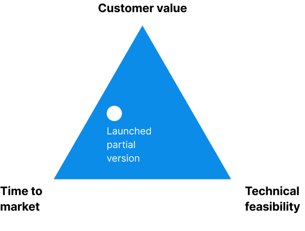
The decision: I advocated to ship the partial version. Even if users could only edit the most recent upcoming order, that solved 80% of the use cases (Ie. skipping a vacation week) and it didn’t severely hurt the user experience.
The experience wasn’t perfect but the PM and I decided to launch fast to gather insights and plan a phase two once the backend caught up.
We added transparent messaging (banners and statuses) to explain to users that future orders would ‘unlock’ once the current one was processed.
Final Design
A system built for trust
The final solution is a clean, dual-tab interface that brings Loblaws subscription experience to parity with industry giants.
Before
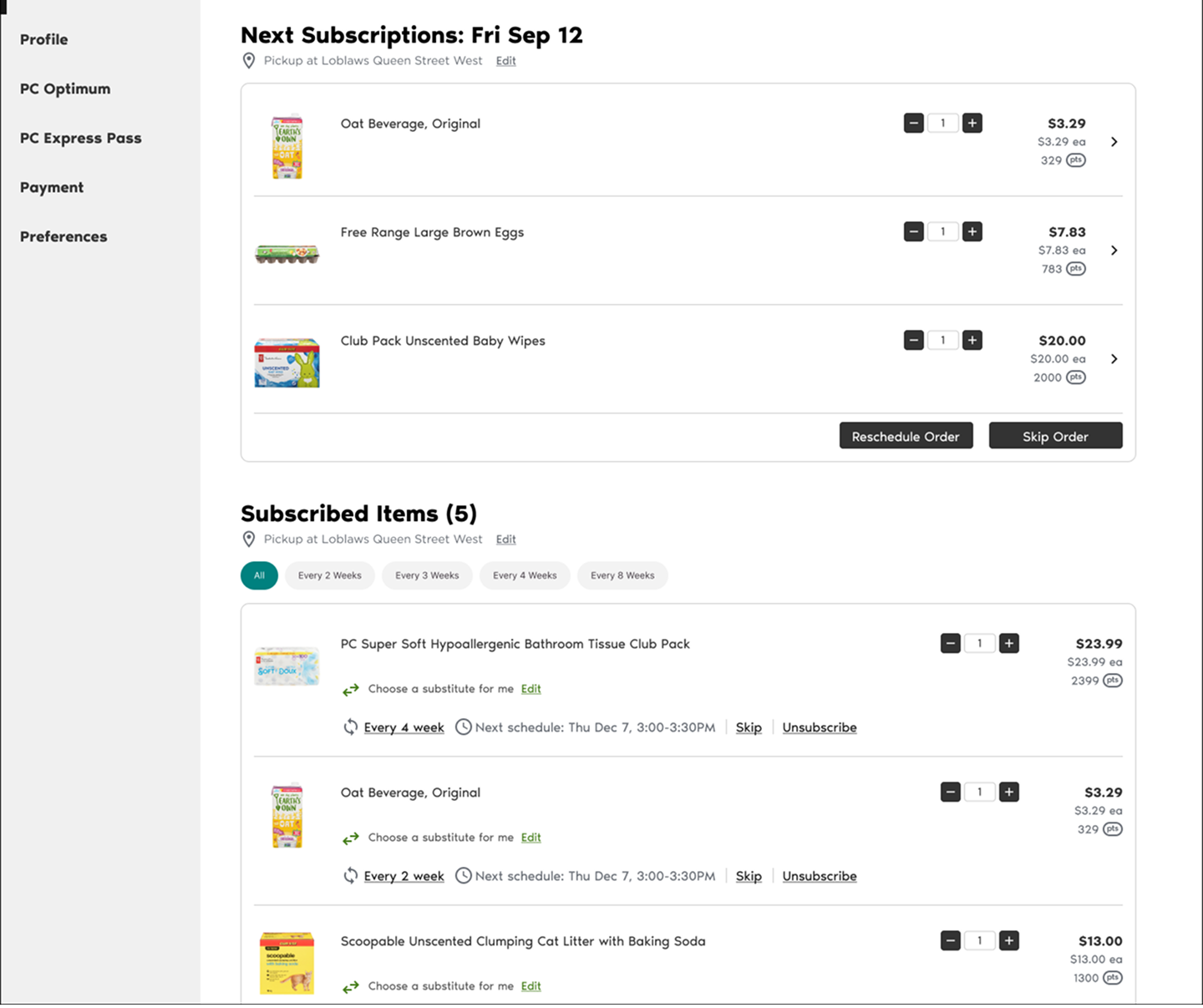
Cancellation and frustration
Concept C:
Two-Tab Model
Separating ‘scheduled orders’ (short-term) from ‘subscribed items’ (long-term).
Verdict: 🏆
This aligned perfectly with how users think.
After
Flexible, self-serve experience
Expected Outcomes
While the feature is currently in development, we have established clear success metrics:
North Star: Retention rate increases
Efficiency: Reduction in Customer Support tickets regarding order changes
Feature adoption: Strong engagement builds business confidence to add more subscribable items and scale S&E to other lines of business like Shoppers Drug Mart.
Retrospective
Looking back, two key lessons stood out:
Validate constraints early. Despite multiple check-ins, the backend limitation surfaced late. While we handled it, I would get more developer eyes involved next time to avoid those surprises.
Design beyond interface. Not all friction comes from design, like fulfillment rules that require a $30 min spend before checkout. It affects the overall S&E user journey. I’d continue to work with product to get closer to a true ‘set-and-forget it’ subscription promise.